Choosing colours for a website
When building a website, design, graphics and page structure play a hugely important role. The more appealing a page is to the customer, the more in demand it will be. You’d be surprised how much a page’s colours affect how information is understood and absorbed. They create certain psychological associations in people’s minds. So which colour or colour combination should you choose when building a company page?
Yellow – a great choice for a children’s website
Scientists have proven that bright yellow makes people smile. That’s why it’s used to create playful TV shows, adverts and websites aimed most often at children. Interestingly, the characters in “The Simpsons” are yellow for a reason too – their creators wanted to catch the viewer’s eye and raise a smile. This colour is also very intense, so it’s most often used in design to highlight small details.
Red and its dark shades create an elegant design
Most people probably know that red strongly attracts attention. That’s why prohibition signs, firefighting equipment and traffic lights are red. On top of that, red is used on websites too, to emphasise and highlight what’s important. It’s worth noting that it should be used sparingly in design: too much of a vivid red can make people feel anger or anxiety. But combining red with its lighter or darker shades creates a great, appealing, elegant design that not only draws attention but also stirs strong emotions.
Green – the colour of nature portals
Green symbolises the earth, life and vegetation. It’s a calm, reliable colour. That’s why it’s most often used to signal a possible or permitted action, such as at a traffic light. You’ll also notice this on websites that offer software to download. Thanks to its calming qualities, light green shades are often chosen by pharmaceutical websites. Meanwhile, a richer, darker green design is often used on websites related to finance and banking, while moss green is very often used on nature-conservation portals.
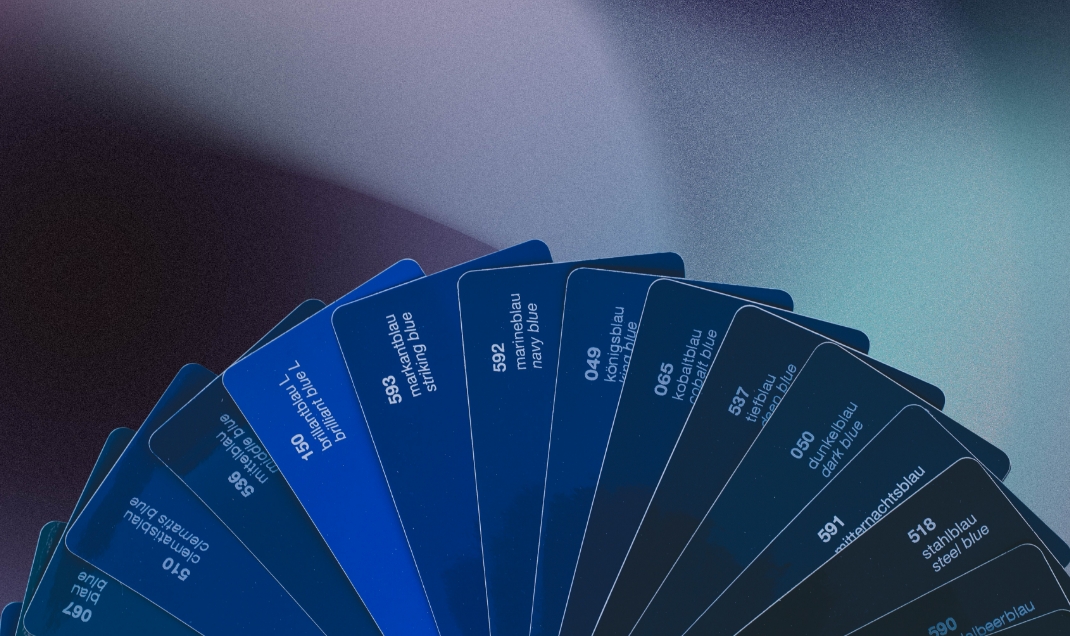
Dark blue emphasises reliability
Blue symbolises the sky and the sea, so it’s used to convey calm and responsibility. How this colour is applied in design depends heavily on its saturation. A soft blue is calming, which makes it suitable for various leisure and recreation pages offering relaxing services (spa complexes, for example). It’s also well suited to pages related to cleanliness. Dark blue, on the other hand, brings out reliability, strength and expertise. That’s why this shade is often used for business portals.
Classic black
For many people, black symbolises misfortune, fear and sadness. But did you know that this colour also symbolises the classic and the elegant? It’s important to stress that this colour should be avoided on its own. Combined with shades of other colours (grey, black, gold and so on), it creates a great design for the pages of courts, lawyers and the like.
These are just the main colours and their properties. To pick the right composition for your page, it’s very important to build a colour scheme from one main colour and the colours next to it on the colour wheel. What’s more, before building a company page, pay attention to your logo and, if you have a “Style Guide” (brandbook) created specifically for your company, to the materials prepared according to your corporate identity guidelines. Usually the very colours used in the logo and/or “Style Guide” are the ones used to create the design. Combined together, they create an appealing design that matches your company’s style and is aimed at your target audience.


